If you've had a look at the fine print you'll already know, the book cover was made using Creative Commons licensed images from the Internet. It is in itself supposed to be a testimony of how you can publish books and other things as part of an Open Source continuum. I wanted to make a nice cover image and I wanted to find and use only images licensed under suitably licensed pictures. Even if I could have used some clipart too, in this case I did not want to do that out of pure principle. I wanted everything in the book to be Open Source. Of course the other Open Source ingredient in the book is the Epilogue, which was written by Linus Torvalds and I copied it into the book since it was available under the GPL license.
The idea of an image and the symbolism within
I already had a rough idea of what image I wanted to have on the front cover. It should have absolutely nothing to do with computers. I also came up with a "Man meets penguin" theme, where I would myself be wearing a tux, or tails actually, and would be there together with a penguin. This would symbolise the message of the book: That mankind has a lot to learn from Linux and Open Source. Originally I was actually planning to shake hands with the penguing, but eventually I settled for this composition where we are sitting down for a discussion. Presumably the penguing is doing the talking and the man is learning from him. For a background setting I wanted to have a vineyard, since that is how the book starts. As I said, I wanted to come as far away from computers as possible. I also think a vineyard aptly symbolises fertility, abundance or even richness - fruits of Open Source. As the final picture turned out, I think it also embodies the "Philosophy" part of the books title quite well. After all, sitting with a glass of wine having a philosophical discussion is... very philosophical.
Finding the images
It is actually not that easy to find Creative Commons material on the net. The Creative Commons site provides a very nice interface to various services where a Creative Commons license can be used as search criteria. There is just one problem with these tools. They don't know the difference between different media. So when I tried to find pictures with penguins, I would find a lot of blogs with text about penguins, but no pictures. People searching for CC licensed music often face the same problem. But searching for images there luckily is a great tool available! Flickr!. Flickr is not a search engine, it is just a place where lots of people store their photos. So you can only search among the photos on Flickr, not photos on the entire Internet. But luckily, there are millions of photos on Flickr alone. And most importantly, Flickr allows users to mark their photos as CC licensed, and you can use the licensing as a search criteria. So, I went to Flickr to find a vineyard. Actually, it was harder than I thought. So I extended my search to cover any gardens. I finally found a garden that looked green and fertile enough. The Butlers House Garden: 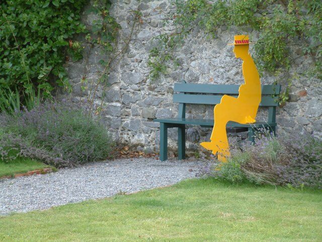 Garden (cc) 2004 Bernie Goldbach (by-sa) Of course, this is a garden on a foggy day in Kilkenny, Ireland. Not exactly the sunny Beajolais vineyard I was planning for. But just wait and see, that will be just a minor detail to fix. Then there is this yellow man sitting on the bench. Well, we will have to make him disappear. Actually, it was at this point I decided to have a sitting conversation with the penguin instead of shaking hands with him. So, now we have a garden, but I still want to make it a vineyard. So, we need some grapes. I actually found a very nice picture of grapes quite easily. These are from sunny California, and it is actually a very good thing that the picture is very sharp and bright, and high resolution, with some grapes very close up to the camera. Yumm... they look tasty. This is gonna be a nice picture.
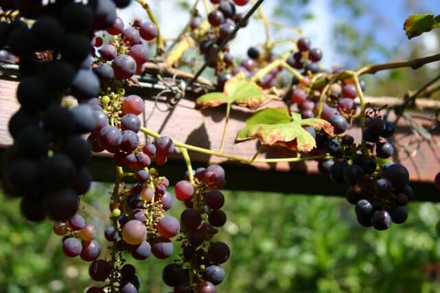
Grapes (cc) 2004 Kees de Vos (by-sa or by-sa-nc?)
(Hmm... I can see now that the license of this picture has changed. Now it has added the Non-Commercial requirement, but in 2005 it must have been licensed as just ShareAlike, since otherwise I would not have used it.) Then I needed a penguin. There were no penguins on Flickr. This is understandable, since not many people live in places where they could photograp them. But, another great resource of Open Source licensed images is actually Wikipedia. And indeed, the Wikipedia article about penguins has images that could be used. (Actually, there are more pictures now.)
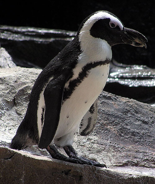
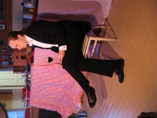
But unfortunately the pictures in the Wikipedia are not of very high resolution, at least not this one. This is not good for a picture that will be used in print, even though it is more than enough for something like Wikipedia. So I spent a long time trying to find a better penguin, but with no luck. I found some photos of penguins, which were not CC-licensed. They were very nice, and I was actually tempted to use them without a license. Hey, nobody would ever find out where the image is from! But I resisted the temptation and ended up using the low-resolution Wikipedia penguin instead. Actually, with a little enhancement it looks just fine on the cover. So with these pictures found, I only needed one more: of a man in tails. This is easy, I am a man and have the suit from my wedding in the closet. So we went to Lahti where we have relatives who do advertisments and other prints every day. They helped take some pictures, with some lighting as if I was sitting in the Mediterranean sun. On funny detail that amused us all in Lahti: Something had happened to my tummy after our wedding. I was expecting the pants to be a little tight, but actually I could not get them closed at all. My waist had grown about 10 cm! So on the picture on the cover I'm really sitting with my pants open :-) After all, I don't get to be on book covers that often. So this was an opportunity I didn't want to pass on.
The GIMP
Now I was set to go. I started working on the cover using The GIMP. The GIMP is a quite powerful Open Source graphics software. In fact, for a long time it was the most advanced program available for the Gnome desktop (or more precisely, the GTK widget set) so many nerds would just be drooling on how powerful it was. To tell you the truth, it is not all that good. Especially the 1.0 series of GIMP had just terrible usability. It was possible to do most of the things required by advanced graphics artists, but it was really difficult. The 2.0 version is actually a little better already and now I just heard about a slightly modded version: The GIMPShop.
The composition
Anyway, I was already familiar with GIMP, and quite content with the improved 2.0 interface. The only problem was that with large high-resolution images i don't think GIMP is very fast. Also, the computer I was using was quite old. This made the image editing process quite slow. Using an effect on the image would take several minutes. So to be able to work faster I actually made scaled-down versions of all images that I would use as a mockup working copy. Then when I had finished moving them around and trying different effects, I had to do the same operations on the real-size images. Here is an early mockup of my idea for the cover. I immediately liked it... 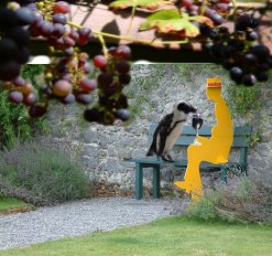
Showing off with effects!
Then I had to replace this yellow man with a real man. Well, myself. Here I have worked some further on the cover... 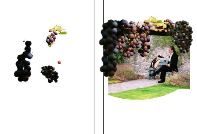
I couldn't just copy myself onto the yellow cardboard-man, I actually had to erase most of him. This is where a tool known as "rubber stamp" comes in handy. This is probably the most important tool in photo retouching! So I replaced the yellow man with parts of the brick wall. And while I was at it, I used the rubber tool and copy paste operations some more. Notice how there are more grapes and the plant on the brick wall has grown if compared to the previous image. This is all standard practice in all printed media today. Bigger boobs, smaller waists, more grapes... nothing you see is real anymore. Also you'll see that I've used various filters to make the grass look greener and the flowers more colorful. After all, we are sitting in the sun, not in foggy Ireland. The penguin was especially important. I added some bright yellow light so that it doesn't look out of place in the Mediterranean atmosphere.
The red glass
One problem I had not thought of was the wine glass. When taking the pictures of me we had used a red background so it would be easy to cut it away around me. But the transparent glass was a problem.
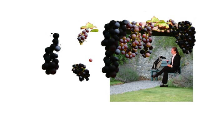
I was actually a little bit worried about this. But then I found the miraculous "Color -> Alpha" tool in the Filters > Colors menu. And with just a couple of clicks, the pink color vanished and became transparent, looking like the glass was really photographed in front of the brick wall. Kudos to GIMP for this trick. It was a magic moment!
Background and text
Then the picture was finally ready and it was time to select the background around it. Actually, I'm not any good with colors. This has always been a problem for me, being a web designer and everything. Early on however I learned to take advice from my brother and father to pick colors. And now I use my wife instead. I had the idea to have a white line that would extend from the path in the image, but she picked the green and blue. 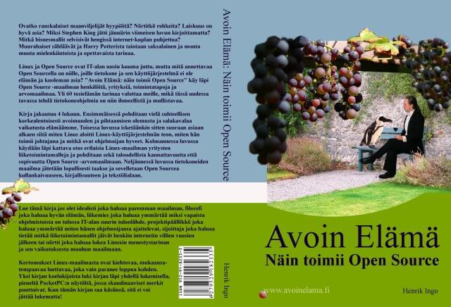
Then I also used some left over grapes to decorate the back-cover. Actually, the same leaf is also in the picture. Can you find it? And the little pink grape looked so delicious, I added it to the www.openlife.cc address. And from there it also found its way to the site's CSS, so it is now a marker for all links on this site. All this just based on an artistic inspiration from a well photographed and delicious looking grape.
The end
All in all it took about 2 weeks to work on the cover. I'm very pleased with the result, and GIMP proved to be a worthy tool for the job, even tackling the red glass problem with excellence!
- Log in to post comments
- 39936 views

Approval for commercial use
Found this blog via Google. Nice use of my grape picture, and I would like to grant you commercial use (indeed the license changed over time :)).
Kind regards,
Kees de Vos.
Thanks!
Hi Kees
Excellent, thanks for stopping by! And what a relief, for all these years I was in doubt if I had been careless in selecting your picture, or if the license had changed. Now my conscience is clear!
Btw, still today I do like these grapes, they set the theme for the whole book very well.
Which format?
Very useful article. Beautiful cover too :)
While attempting to use 100% foss tools to do a book, I stumbled upon this page via google.
I got one question. I see your book has a printed version too. In which format did you send the cover to the printer? Did you do color separation yourself? Or did you send an uncompressed TIFF or a pdf? Or was it simply a jpg? Thanks very much.
Book was printed from PDF's
Hi Lohan
Btw, I intended to write about printing the book using lulu.com, but that never got done :-( Anyway:
I used different printers for the Finnish and English book. For the Finnish one I used a local digital printing/copy shop. I just saved a PDF with OpenOffice for the text. For the cover I think I did something silly, like saving it as TIFF and then using OpenOffice to create a PDF of that TIFF. I print small amounts, a few hundred, at a time. The colors on the cover shift a little between prints, but that's all. Layout, fonts etc have worked well.
For the English book I used Lulu.com, which receives the orders directly from Amazon (and others...) and prints a copy of the book on demand. The convenience of this is that I don't need to do anything when books get sold. At the time at least, Lulu.com required an Adobe Acrobat generated PDF, which was an extra hurdle for me. Eventually I realized that for such a one-off task, I could install the trial version of Acrobat and get it done.
I realize the OpenOffice PDF generator doesn't convert colors to CMYK. And doesn't embed fonts perhaps? So I guess there is a reason Lulu required proper Adobe generated PDF's.
To be honest, I cannot comment on the quality of Lulu.com, since I never see the books as they go out. The one example copy I got hasn't got the text on the back spine of the book properly centered, even though it definitively is so on the cover I've created.
Thanks very much for
Thanks very much for responding Henrik :) I read your book too. It's really fascinating. Great work!
In the meantime, I did some more search and found 'Separate+', a cool plugin for GIMP which exports GIMP images as CMYK TIFF images :) http://my.opera.com/area42/blog/gimp-cmyk
And there's another plugin called Tiff 2 PDF for Gimp
http://my.opera.com/area42/blog/cmyk-tiff-2-pdf-for-gimp
That solved my colour separation problem.
From what I see, with these two plugins, all the pre-press work of a cover can be done on GIMP and GIMP only :) Cheers!
And that plugin uses Adobe
And that plugin uses Adobe color profiles when exporting so I hope this will be a useful solution for those who use Lulu too.
CMYK TIFF images in GIMP
Hi Lohan
Thanks for the tip! That is indeed useful for someone looking to create printable material.
I'm not sure what Lulu does (and I think the process has changed once or twice since I published my book), but it may still be explicitly checking that PDF files were created by Acrobat, plus a certain version, etc. (Like some websites check for browser version.)
But it is still great to know that you could now properly do the pre-press work from GIMP. For instance that would have helped me with the Finnish books, where the printer probably manually adjusts the color profile now.
And that plugin uses Adobe
And that plugin uses Adobe color profiles when exporting so I hope this will be a useful solution for those who use Lulu too.
Great tutorial. I must create
Great tutorial. I must create something similar on my own blog :)
Thanks. Only now I realize
Thanks. Only now I realize this has to be some of the most read entries on the entire site! Maybe I should become a GIMP expert instead of MySQL expert...
Hi Hingo -- great tutorial,
Hi Hingo -- great tutorial, thanks for posting it, and great looking cover! . . . I was wondering how you started the cover (how did you know the size of the front, back and spine) and how did you start the file -- did you just go New >> Image? Thanks!
Actually, it's nothing fancy.
Actually, it's nothing fancy. I only did the graphics in GIMP, saved it and opened it as a background image in OpenOffice Writer. I have the size of the book cover from the printing shop, used those measurements in OpenOffice and then picked an appropriate font.
The main reason to do this was simply that OpenOffice allows me to save all of this as PDF. I'm sure it screwed up the color profile (OpenOffice doesn't do CMYK colors which is good for print) but it was good enough.
Thanks for the reply Hingo!
Thanks for the reply Hingo! I've never used OpenOffice, but I just downloaded the package . . . so it looks like you just opened a regular OpenOffice doc to do it . . . how did you set a custom paper size to match your cover dimensions?